Inside the 1920 Bungalow: A Soft, Arched Primary Bathroom
- Apr 30
- 4 min read
Updated: 3 days ago
This bathroom didn't exist before we started. The 1920 Bungalow was originally a one-bedroom, one-bathroom — full of potential, but missing the kind of layout people are looking for now. We gutted nearly the whole house and added a primary suite from scratch — a second bedroom, a walk-in closet, and this ensuite — taking the home to a true two-bed, two-bath.
From the start, I wanted this new addition to feel like it had always been part of the home. Calm, layered, a little quiet — and never like an addition.
If you've been following along, this is part of the same renovation we previously shared [living room post → link]. Same house, same warm, lived-in approach — different room.

A quick note before we get into it: a few of the links below are affiliate links through ShopMy, which means I may earn a small commission if you shop through them. Every piece here is something we actually used in this bathroom — nothing extra, nothing filler.
From a Two-Bedroom Bungalow to a Primary Suite
When we gutted the home, the goal wasn't just to refresh it. We reworked the floor plan to add what the original layout was missing. We enclosed a small front porch to gain square footage, then built out a primary suite from there — taking the bungalow from a two-bed, one-bath to a true two-bed, two-bath.
The bedroom opens into the bathroom, and the closet opens off the bathroom — so the whole new addition is connected through this room. The toilet has its own small room with a door, which makes a shared primary feel a lot more livable. In a small bungalow, every square foot has to earn its place.

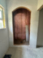
Why I Started With the Arches
I knew before anything else that I wanted arches in this space. Two of them, actually — one at the shower entry and one as the doorway leading from the bathroom into the walk-in closet. They mirror each other across the room, and that quiet repetition is what makes the bathroom feel finished rather than busy.
Arches are also a small nod to the age of the home. They give a new addition a sense of history without being literal about it, and they soften every line in the room.

The Tile Pivot That Changed the Whole Room
The original plan was black-and-white tile with a black vanity. Bold, graphic, a little high-contrast — and on paper, it was the right move.
Then we started laying the tile out for pattern placement, and it stopped feeling right. It read sharp instead of grounding. So I paused everything for a day. (One of the better decisions I've made on this project, honestly.)

The next morning I stopped into Floor & Decor and found this soft floral marble mosaic. It had warmth and a quiet pattern — busy enough to be the moment, gentle enough to live with. We bought every box they had in stock and sent a team member on a road trip the next day to pick up the rest from another location.
That tile is the reason the bathroom feels the way it does.

The Shower: Marble, Brass, and Two Niches
The shower walls are marble-look quartz slab — clean, calm, no grout lines. Inside the simple slab, we ran a marble herringbone floor, which is the one place in the whole bathroom where I let the pattern get tight. It works because everything around it is quiet.

We added two niches in the shower instead of one. The standard niche sits at eye level for shampoo and soap. Below it, a second smaller niche specifically for shaving legs — small, recessed, and exactly where you actually need it. The kind of detail you don't think about until you have it, and then you can't imagine the shower without it.

A High-Low Mix That Carries the Room
The vanity is from Lowe's. The fluting adds texture without taking up visual space, and the soft greige finish reads quieter than a white vanity would have in a small room. It's also part of why the high-low blend works — a Lowe's vanity holding its own next to Studio McGee × Kohler shower fixtures.

The shower fixtures are from the Studio McGee × Kohler collaboration in champagne gold — a soft brass that picks up the brass on the mirror and sconces. The sink faucets are polished nickel, a deliberate contrast that keeps the room from feeling matchy. Two metals, on purpose.

The mirror is the most personality-forward piece in the room. The shape feels almost vintage Italian, and it does the work of an art moment without being one.
The Small Details That Made the Bathroom
The arched closet doorway, set directly across from the shower arch. The two arches frame each other every time you walk through the room.
The separate toilet room with a door — a small move that makes a shared primary feel like a real one.
Black matte door hardware against the warm brass throughout — another quiet contrast that keeps the room from going to one-note.

The Small Details That Made the Bathroom
If you've been saving this room (or planning your own), here's what's in it. You can also find these and the rest of what I'm sourcing on my ShopMy.
Closing
This bathroom didn't follow the original plan, and that turned out to be the story here. The shift brought the calm, layered feel I was after — and made the room feel like it was always meant to be in this house.
Sometimes the best design decisions come from a small pause.
More rooms from the 1920 Bungalow are coming. The living room journal is already live, and my full ShopMy is where I keep everything I'm sourcing right now.
Designed by HIDG